What is Local?
Local is more than a real estate brand — it’s a promise.
It exists to protect and empower small towns, keeping property decisions in the hands of those who truly know the place. Every Local agent is a genuine member of their community, living its history, understanding its people, and working to preserve what makes it special. Backed by the national support of The Network, Local combines professional systems with grassroots heart — so every move is made with trust, care, and deep local knowledge.
Genuine Local
Trust Over Transaction
Community Protector
Practical & Caring

The Name Choice
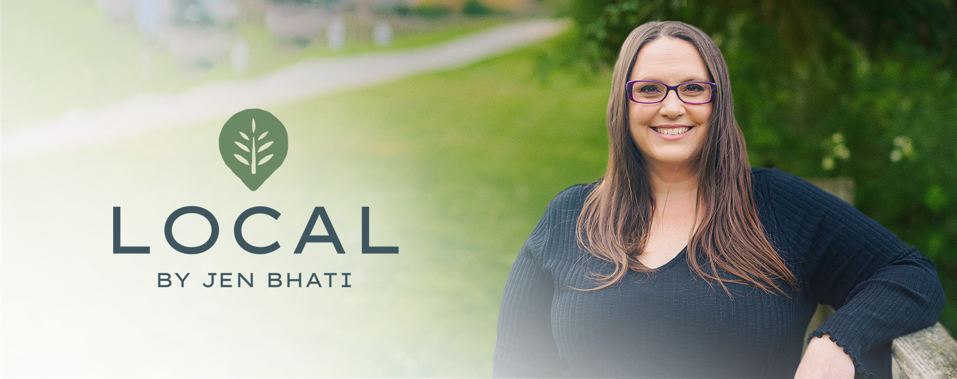
The name Local captures the brand’s promise: every agent is a genuine part of the community they serve. Adding by Jen personalises it for Featherston, building instant trust. Strategically, it also creates room to grow — allowing the model to expand into other towns simply by changing the second half of the name, from Local by Jen to Local by [New Agent], while keeping the core brand identity intact.
Colours – Rooted in Nature
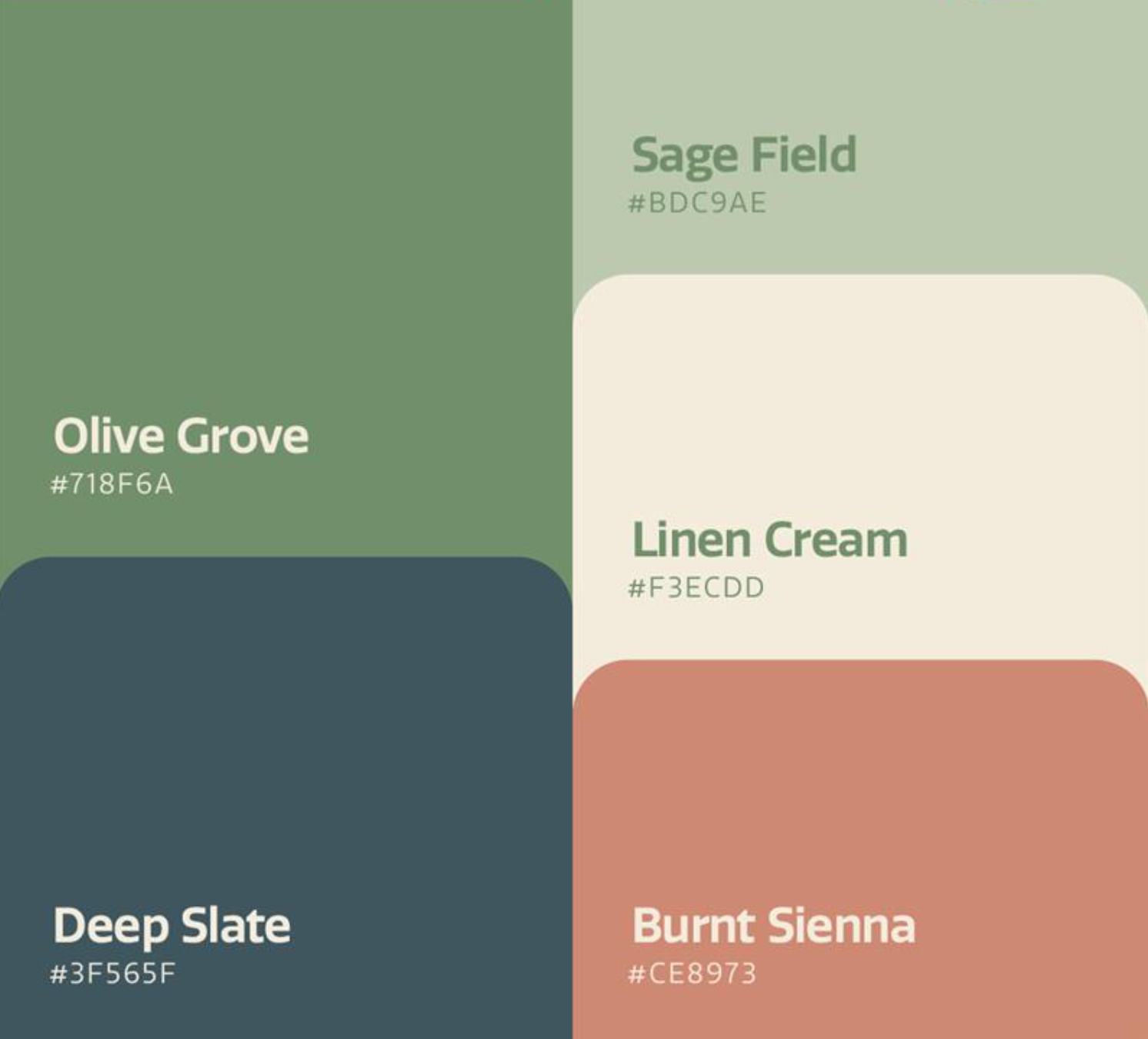
The palette blends earthy greens (Olive Grove, Sage Field), calming blues (Deep Slate, Muted Teal), and warm neutrals (Linen Cream, Ivory Mist) with rich accents (Burnt Sienna, Rusty Terracotta). Together, they feel authentic, welcoming, and deeply connected to small-town life.


Logo & Icon – The Fern of Belonging
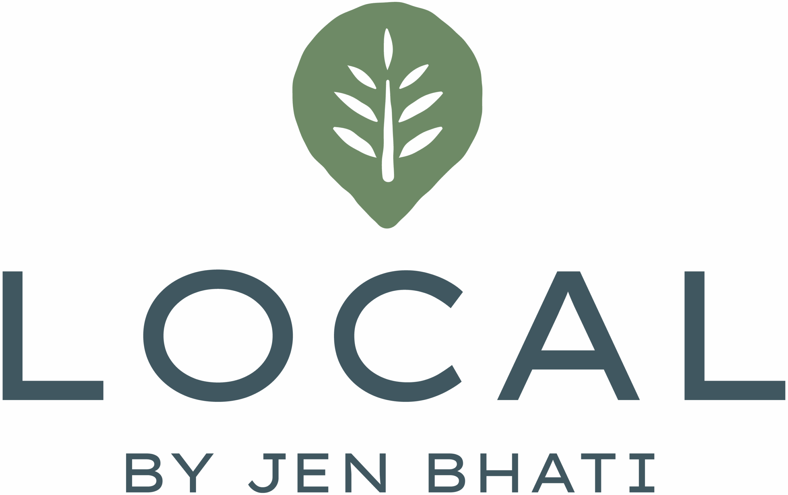
The Local by Jen logo pairs clean, modern typography with a stylised fern set inside a location pin. The fern, a symbol of growth and identity in Aotearoa, anchors the brand in its New Zealand roots, while the pin signals its hyper-local focus. The edges of the icon are intentionally a little rough — a subtle nod to the character and authenticity of small-town life, avoiding the over-polished feel of big-city brands. Simple yet distinctive, it’s instantly recognisable across towns and easily adapted for each Local by [Name] expansion.
